How to choose the perfect paint
One of the many joys of buying a brand-new home is the presence of unblemished plasterwork and pristine paint. However, to appeal to the widest possible audience, these paint colours are usually always neutral – magnolia, gardenia or pure brilliant white.
As familiarity blunts the appeal of these studiedly inoffensive paint colours, people often find themselves wanting to redecorate. After a year has passed, giving plasterwork time to dry out so any settlement cracks can be treated, it’s possible to paint each room in your home any colour you like. However, before rushing out to your local DIY store, it’s worth considering why some colours work better in one room than another. It’s also important to consider how everything from natural light levels to accessories might impact on your preferred shade…
Let there be light
Start your colour palette deliberations by considering a room’s size and brightness. South-facing apartments are flooded with light throughout the day, whereas north-facing rooms will feel a touch dull by comparison (though this is often better for working or watching TV). Darker shades work better in naturally bright rooms, and bigger spaces also support darker paint tones better. A nursery or study might feel closed in if it’s decorated in a dark hue, whereas the same colour in a dining kitchen could be quite striking.
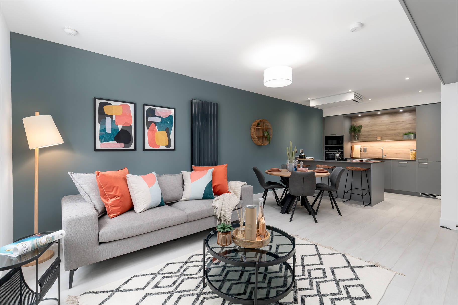
Consider what’s already there
Mention of kitchens brings us onto our next point – the existing colours in each room. If your cabinets are dark gloss, a lighter shade of paint will provide a more fitting counterpoint. Similarly, if your bathroom tiles are grey or brown, more colours will complement these hues than bold tile choices such as emerald. This philosophy extends to signature furnishings, too. A royal blue Chesterfield might make a dramatic statement in isolation, but it needs light or neutral colours around it to offset it effectively. Also avoid mixing bold colours with stripes.
Complement paint with accessories (and vice versa)
A yellow bedroom featuring purple cushions and a red throw will look chaotic. It could even impact on your ability to sleep. Bold accessories are fine – orange footstools, blue bedding, green curtains – but they’ll only work if the walls around them are neutral. The opposite is also true; if you’re keen on vividly coloured walls, ensure curtains and soft furnishings are light or pale. This doesn’t have to translate as boring – emerald-green walls would complement beige tartan cushions and curtains, contributing to a Highland ambience.
Think about maintenance
Gloss paint has historically been the preferred choice for skirting boards and architraves. Yet when it’s time to freshen up your brightwork, satin lasts longer and doesn’t discolour as quickly. That’s crucial in small or internal rooms where even a modestly sized radiator could lead to rapid yellowing. Similarly, homes with pets or small children should consider washable paint. It’s more expensive than standard matt but it can be scrubbed clean over and over without fading or rubbing off. It’s a great choice for scuff-prone hallways.
Put on another coat
Don’t be seduced by the promise of one-coat paints. A single coat of beige over magnolia walls might suffice, but bigger colour changes are rarely achieved with a single application. Read online reviews of a shortlisted paint brand to ensure the composition isn’t overly watery – multiple applications may be required if it is. Thicker paint is easier to apply and produces fewer drips along the way, achieving a more consistent finish. Seek professional advice by asking a local decorator what range they tend to use – trust their expertise in this area.
Back to Latest Posts