Accessorising with bold colours
Fashion is a concept that often seems detached from day-to-day life, but it has a significant impact on everything from clothing ranges to show home design. For instance, there were raised eyebrows earlier this year when Pantone declared Very Peri to be their 2022 colour of the year. This luminous shade of lilac isn’t to everyone’s taste, but it’s illustrative of how bright colours are returning to fashion, especially around the home.
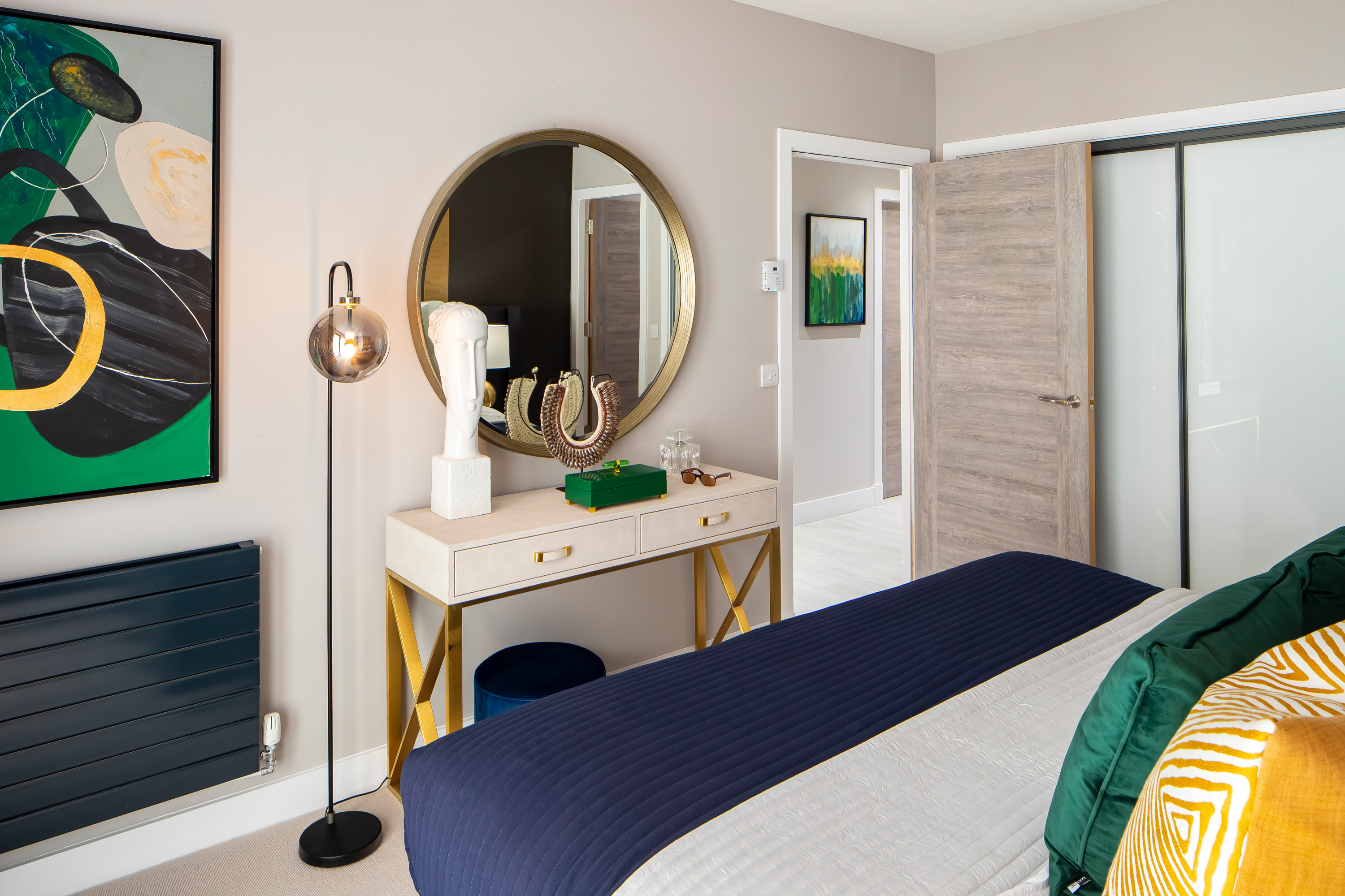
It's worth noting at this point that the UK has an enduring love affair with neutral interior colours. Visit a bathroom showroom and see how few suites are in a colour other than white; go to a kitchen retailer, and you’ll mainly have a choice between natural tones, white or grey. That’s because plain backgrounds and furnishings can be quickly and effectively accessorised with bold shades. From soft cushions to statement furnishings, vivid colours provide an eye-catching and affordable way to add your stamp to an otherwise blank canvas, such as a newly completed home. Plus, if you tire of a particular accessory, it’s far easier to swap it for another than to steam off vibrant wallpaper or rip up a vivid carpet.
These are Cruden Home’s tips for accessorising with bold colours, giving your home a snap of character and warmth as nature adopts its own autumnal palette…
Combine two colours for complementary effects
Some colours work together, but others don’t. Red and blue would be a challenging combination, whereas lilac (okay, Very Peri) and a soft yellow could combine to good effect. A single cushion, vase or throw might be sufficient in one colour, if you have a few splashes of a complementary shade nearby. Beds are great places to experiment with two-colour styles.
Invest in fake plants
If you’ve ever ventured onto TikTok, you’ll know indoor plants are literally and metaphorically ‘in’ this year. However, the emerald hues of a plastic plant are still eclipsed by the pop of colour delivered by artificial flowers. Again, combine two or more colours to dramatic effect; the seasonally minded could even select autumnal browns and oranges.
Install a triptych
A triptych is a combination of three related pictures in portrait frames, designed to either be positioned side-by-side or across three adjoining walls (such as the blank plasterboard sections above many staircases). There’s endless scope for injecting colour and character here, especially in paintings or colour-accentuated photographs.
Consider psychology
It’s well-known that certain colours have specific psychological effects on our minds. Red is the colour of anger, passion and danger, which is why it’s a bad choice in a bedroom. Lilac is a more calming choice in the boudoir, since purple is generally, the colour of well-being. Different parts of the home require distinct approaches to colour, depending on their roles.
Choose colourful decorations
We’re deliberately keeping the definition of ‘decorations’ broad here. It may include candles and crystals on a Welsh dresser. It might involve hand-painted spheres in a metallic bowl on a windowsill. It could be a harlequin knitted throw, preserved chillis in a glass jar, handmade soaps beside a dressing table mirror… in fact, anything affordable and easy to reposition counts.
Make use of your wall space
A pop of colour on a neutrally decorated wall can be very effective, such as an orange clock face, or London bus-themed bookends on a floating shelf. It’s best to have a couple of examples of this colour (or differing shades) on display across a wall, to imply a sense of coordination. Even picture frames and hanging hooks can be statements in their own right.
Back to Latest Posts